Quantcast
Channel: Comments on: Color Theory Explained
Viewing all 64 articles
Browse latest View live

Color Relationships: Creating Color Harmony

$
0
0

Color Relationships: Creating Color Harmony

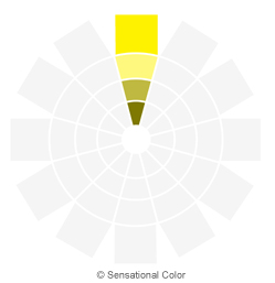
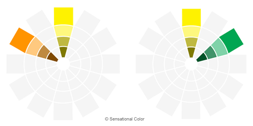
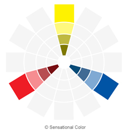
What is Color Harmony? Harmony is nature’s way of saying that two or more things together make sense. Color harmony represents a satisfying balance or unity of colors. Combinations of colors that exist in harmony are pleasing to the eye. The human brain distinguishes the visual interest and the sense of order created by the harmony and forms a dynamic equilibrium. Experts have specific ideas based on the principles of color theory and color psychology of color combinations that are aesthetically appealing and pleasant. The color wheel becomes the designer’s tool for creating the harmonies. Just keep in mind, as you learned in "Get to Know the Color Wheel" that it is color relationship reference tool not color selection tool. Once you have a harmony in mind you will then use your a fanguide, chip rack or online tool that shows the hundreds or maybe even thousands of colors you have to chose from. Creating Color Harmony The basic formulas for creating harmony are described and illustrated on the designer’s color wheel. This section focuses on understanding color relationships and how to develop a finished palette that is pleasing to the eye. Successful color schemes rely on your knowledge of hue, value and chroma. We have all heard someone say “those colors clash” or ‘don’t work together.’ What follows are examples of the color harmonies found on the color wheel that all begin with the color yellow as the common color however you could create these harmonies with any of the twelve hues on our color wheel Color Harmonies Monochromatic harmony uses various values (tints, tones, and shades) within the same color family. Color Relationships: Creating Color Harmony - Monochromatic   Analogous harmonies are based on three or more colors that sit side-by-side on the color wheel.

Color Relationships: Creating Color Harmony - Analogous

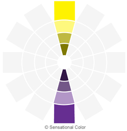
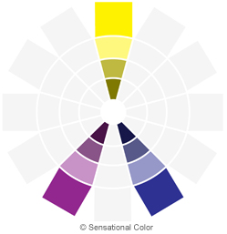
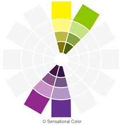
  Complementary colors (or Direct Complementary) are those that appear opposite each other on the color wheel. Color Relationships: Creating Color Harmony - Complimentary A split-complementary color arrangement results from one color paired with two colors on either side of the original color’s direct complement creating a scheme containing three colors. Color Relationships: Creating Color Harmony - Split Complimentary Double complement harmonies include two sets of complementary colors that sit next to and across from each other on the color wheel forming an X. Color Relationships: Creating Color Harmony - Double Compliment   Tetrad combinations are made up of four hues equal distance from one another, forming a square or rectangle on the color wheel.

Color Relationships: Creating Color Harmony - Tetrad

  Diad schemes are combinations of two colors located two steps apart on the color wheel, skipping the color in between. Color Relationships: Creating Color Harmony - Diad   Triad colors are three colors equally spaced from one another, creating an equilateral triangle on the color wheel. Color Relationships: Creating Color Harmony - Triad   Use color harmonies along with hue, value, and chroma to develop your color schemes. Color can come first or last in the design process. Some designers prefer to choose each color, identifying the color harmony and color description, then find the other elements for their design. Other designers will do just the opposite and create their color plan by responding to an inspiration or another element of design. Besides taking into consideration color theory: hue, value, chroma, and color harmony, you also need to understand how people might react to the palette on a psychological basis. Learning the meanings and associations of the different colors can assist you in finding just the right colors.

The post Color Relationships: Creating Color Harmony appeared first on Sensational Color.


Get To Know The Color Wheel

$
0
0

Get To Know The Color Wheel

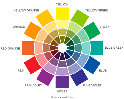
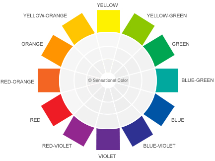
The color wheel is a tool for understanding color and color relationships. Think of it as your cheat sheet or "SparkNotes" for color. The most common color wheel and the one that I use is the twelve (12) hue wheel. A color wheel could have as few as six hues or as many as 24, 48, 96 or more.

Get To Know The Color Wheel

I think twelve is the perfect number when you remember that the wheel is a color relationship reference tool not a color selection tool. The color wheel will get you into the ball park by giving you ideas for a variety of ways to combine colors and create color harmonies. When you get ready to select actual colors for a project, you will use a fanguide, chip rack or online tool that shows you hundreds or maybe even thousands of colors. The quickest way to become familiar with the color wheel is to look at each of its parts. Hue: A hue is the purest or brightest form of a color. Hues are colors that have not been mixed with white, gray, or black. The twelve colors around on the outermost part of the wheel are hues. Get To Know The Color Wheel - Hue Tint: The circle of colors next to the hues represent the tint of each hue. A tint is the hue mixed with white. The hue may be mixed with just a touch of white or with so much white that the hue is very faint. All are considered a tint of the hue. On the color wheel only one tint is shown. This is the hue mixed with 50% white. Get To Know The Color Wheel - Tint Tone: The next circle of colors represent the tone of each hue. A tone is the hue mixed with true gray. The hue mixed with any amount of gray is considered a tone of the hue. On the color wheel only one tone is shown. This is the hue mixed with 50% gray. Get To Know The Color Wheel - Tone Shade: The inner most circle of colors represent the shade of each hue. A shade is the hue mixed with black. Just as with the tines, the hue may be mixed with just a touch of black or with so much black that you are hardly able to detect the hue. All are considered a shade of the hue. On the color wheel only one shade is shown. This is the hue mixed with 50% black. Get To Know The Color Wheel - Shade Each of the twelve (12) hues on the color wheel plus all of the many tints, tones, and shades that are made with each hue make up the colors you see on the color wheel. Color Family: Each segment on the color wheel represents the color family of that particular hue. The segment shown above is the blue color family. Get To Know The Color Wheel - Color Family Now that you know the different parts of the color wheel and are able to define each, we will begin looking at how the colors related to one another on the next page titled: Color Relationships: Primary, Secondary, Tertiary Hues.

The post Get To Know The Color Wheel appeared first on Sensational Color.

Understanding Undertones = Color Success

$
0
0

When it comes to color, it’s what’s underneath that counts. Color is dynamic and energetic. Every color has a vibrant public persona, but it also has more subtle attributes that the human eye does not immediately see. This is what makes color both fascinating and frustrating. One of the most effective techniques for alleviating frustrationContinue Reading

The post Understanding Undertones = Color Success appeared first on Sensational Color.

Color Term Glossary

$
0
0

Accent Lighting: Lighting layer that highlights or builds emphasis, also known as key lighting. Achromatic: Free of color, without color, colorless. Achromatic Simultaneous Contrast: Simultaneous contrast occurring between white, black, and gray. Additive Color: The process of mixing the colors of light. Afterimage: Visual illusion in which retinal impressions persist after the removal of aContinue Reading

The post Color Term Glossary appeared first on Sensational Color.

How Color Theory Came About

$
0
0

How Color Theory Came About

Throughout history, color theorists have attempted to explain how the scientific and psychological aspects of colors operate. They devised systems using supporting frameworks that have evolved. Our current perceptions and understandings of color are based on the accomplishments of these great thinkers. The concepts of color vision, color interactions, and color systems were some of the most important contributions to color education. Theorist’s concepts at a glance… Seeing Color Putting Color Into Systems Understanding How Colors Interact Seeing Color English physicist Sir Isaac Newton (1642-1726) made the most significant scientific discovery related to color when he began experimenting with light rays. He discovered that sunlight is composed of all colors in the visible spectrum; and that light could bend or refract when directed at a prism resulting in an array of colors: red, orange, yellow, green, blue, indigo, and violet, each with different ranges and wavelengths. This led to Newton becoming the first to understand the rainbow and provide our modern ideas about how we ‘see’ color. How Color Theory Came About Putting Color Into Systems Although Leonardo Da Vinci was the first to arrange colors, Sir Isaac Newton was the first to arrange them in a circular shape becoming the model for many future color systems including the current designers color wheel. Johann Wolfgang Von Goethe (1749-1832) designed a numbering system for each hue according to its luminosity: 10 for white through 0 for black. This later inspired Albert Munsell’s value (or gray) scale where white is 10 and black is 0. Albert Munsell, American color theorist (1858-1918) created the first color system accepted by the US Bureau of Standards for use in standardizing pigment specification. He was able to translate the 2-D wheel into a 3-D color tree complete with hue, value, and chroma. How Color Theory Came About Understanding How Colors Interact Michel Eugene Chevreul (1786-1889) was a French chemist whose findings led to psychological concepts of color harmonies. He researched and recorded human reactions to adjacent colors and founded the laws of simultaneous contrast: the effect on a color when placed next to or upon another color. Albert Munsell incorporated the complementary (opposites) combinations and allowed them to be viewed across from each other. Josef Albers (1888-1976) experimented with how monochromatic colors of different values interact through his abstract series, Homage to the Square. How Color Theory Came About Faber Birren, American educator (1900-1988) compiled and added to the elements of harmony: adjacent, opposite, split-complementary, and triad. He also went on to include color interactions with effects of luster, iridescence, luminosity, and transparency.

The post How Color Theory Came About appeared first on Sensational Color.

Can Being Colorblind Make You A Better Artist Or Designer?

$
0
0

Can Being Colorblind Make You A Better Artist Or Designer?

Can Being Colorblind Make You A Better Artist Or Designer?Have you ever wondered what your life would be like if you were colorblind? I have and in every instance I've imagined myself missing out on one of the biggest pleasure I have in life--creating with color. It wasn't until I met Bonnie Auten that I came to realize that what I thought would be an almost unimaginable handicap might actually be a blessing in disguise. Bonnie is a skilled artist who I have admired for many years. I recognized right away that Bonnie had both artistic talent and an eye for color that was better than most. I knew I wanted to study with Bonnie so that I could continue to improve my own ability to have the colors I see be the ones that show up on my canvas. You can only imagine my surprise when I learned Bonnie is colorblind. Early in Bonnie's art career, while waiting for her son to complete his eye appointment, she spied some images in the waiting room that tested color blindness. She looked at each plate. Sometimes she saw an image and other times nothing but a field of dots. She suspected something might not be quite right. She mentioned her concern to the doctor and within a few minutes he revealed that she was correct. Something wasn't quite right. She had failed the tests. Bonnie took more tests and failed those, too. The doctor told Bonnie that she was not only colorblind but one of the worst female cases he had ever seen. Bonnie went home from the doctor's office in tears wondering how she was ever going to fulfill her dream of being a fine artist when she couldn't see all of the nuances of color that most everyone else has the ability so see. Much to her credit Bonnie didn't pack up her easel and give up. Bonnie knew she could see color and so was a bit confused with how she could be considered colorblind. But the term colorblind is a bit misleading. The majority of people that are considered colorblind see color. They just don't see certain colors or the same range of colors as the average person In Bonnie's case she sees many colors very well, but some colors seem to recede or go entirely unnoticed. Some colors look more red or green to her than they do to most of us. What I find most interesting is that by looking at her paintings you wouldn't have any idea that she didn't see the full range of colors. So how does she paint pictures in full color so beautifully? Bonnie learned everything she could both about color and being colorblind. She figured that if she could understand her handicap that she could find a way to overcome it. Bonnie studied all about the properties and principals of color: value and contrast, warm and cool colors, and also about the color wheel and how it works. But most artists study these same things and aren't as skilled at using color, as Bonnie is so I had to know more about her process. Not just what she sees but how she makes decisions about what colors to use and how it is that she can use color so masterfully even though she is technically colorblind. What Bonnie shared is that while she lacks the ability to see some colors as well as many other artists what she does possess is an uncanny talent for seeing value. As soon as I heard her say that she sees value first and color second I completely understood how her handicap might actually be an advantage. Here's why. Value is defined as how light or dark a color is. Simple enough, right? However, I think that it is in the simplicity of the definition that the complexity and importance of value begins to get lost. This is really unfortunate because whether you are student or professional, an artist, designer or DIY'r it is far more important for you to understand value than any other aspect of color if you want to create successful designs. Value is not only the thing that students seem to struggle with most but fully understanding the importance of value is something that many professionals never master. It is the characteristic of color that many people--dare I say--under value. Bonnie explains that "For many artists colors sing to them. Colors sing to them so loudly that they cannot hear the value whispering." I love her insightful explanation and I find the same to be true for designers or anyone that uses color not just artists. Another reason that focusing on value may fall to the wayside is that you can create a pretty good painting, graphic or interior design without mastering value. I see designs and paintings all of the time that are good but would be so much better if more attention had been paid to color value and value contrast. I've even guilty of having created some myself. There have been times when I've come back to a painting or design with fresh eyes and discovered that I had become so enamored with the colors that I had forgotten to step back and consider value. If value and value contrast aren't foremost in you mind it is likely you might not notice that a darker or lighter value of a color may work better. You might feel that something isn't quite right but not immediately recognize that the problem is in the value of a color you chosen or that lack of value contrast between colors because as Bonnie says value speaks with a whisper. You need to evaluate the values of the colors with as much thought as you give to selecting just the right hue. If you are already a good artist or designer yet are not giving a great deal of thought to how you use value, if you make this one change and begin evaluating the values of the colors you choose as carefully as the colors themselves everything you create will be that much better. And if you are just learning to use color taking the time to understand value and how to incorporate a range of darks and lights will help you to more quickly create pleasing designs or works of art. Having knowledge of value or any aspect of color is not an end in itself. Gaining an understanding is only the first step. Studying how others have used value remarkably well will help you to develop the ability to make value work its magic in your designs. It will also ensure that you will hear the whisper of value over the cacophony of color. The painting above titled Labino Tribute by Bonnie Autenm was chosen to be on the cover of the CPSA Signature Showcase Book coming out this year.To learn more about Bonnie Auten and see more of her paintings visit her website http://www.bonnieauten.com/ You might also like my blog post about the workshop and see the painting I did during my two days with Bonnie: If You Want to Learn to Really See Color Try This.

The post Can Being Colorblind Make You A Better Artist Or Designer? appeared first on Sensational Color.

White Animals Vulnerable to Sun Just Like Humans

How Carrots Help Us See the Color Orange

$
0
0

How Carrots Help Us See the Color Orange

How Carrots Help Us See the Color Orange One of the easiest ways to identify an object is by its color -- perhaps it is because children’s books encourage us to pair certain objects with their respective colors. Why else would so many of us automatically assume carrots are orange, grass is green and apples are red? In two experiments by Holger Mitterer and Jan Peter de Ruiter from the Max Planck Institute for Psycholinguistics, perception of color and color constancy (the ability to see the same color under varying light conditions) were examined using different hues of orange and yellow. By using these hues on different objects, the researchers hoped to show that knowledge of objects can be used to identify color. In one experiment, half of the participants saw traditionally-colored orange objects in their respective hue, while the other participants saw the same objects in an ambiguous hue between yellow and orange. The participants that saw the ambiguous hue on traditionally-colored orange objects later called the item with that ambiguous hue "orange". Apparently, seeing the ambiguous hue on a traditionally-colored orange objects led participants to redefine that hue to be proper "orange". In the second experiment, participants saw the same hues, but now on objects that could be any color (e.g., a car). Some participants were shown objects that ranged from the ambiguous color from the first experiment to a strong yellow hue, while others were shown objects in a range of strong orange hues to the ambiguous color. Just as in the first experiment, participants then had to identify a sock that had been colored with an ambiguous hue. This second experiment revealed no differences between the two groups, showing conclusively that it was only the knowledge of how objects are naturally colored that made them redefine the colors in the first experiment. The results, published in the July issue of Psychological Science, a journal of the Association for Psychological Science, determined that the use of top-down processing, such as a carrot signifying the color orange, is delayed in both color perception and also in other perceptual domains. If humans used this conceptual knowledge immediately, it would override perceptual cues and cause hallucinations. “Delayed feedback for learning prevents such illusions, but still utilizes prior probabilities provided by world knowledge to achieve perceptual constancy,” the researchers concluded.
{Psychological Science is ranked among the top 10 general psychology journals for impact by the Institute for Scientific Information. For a copy of the article “Recalibrating Color Categories Using World Knowledge” and access to other Psychological Science research findings, please contact Catherine West}

The post How Carrots Help Us See the Color Orange appeared first on Sensational Color.


The Characteristics of Color

$
0
0

The Characteristics of Color

Language helps you to organize and make sense of the world. It gives you a way of communicating with others using words that represent something or mirror an experience. In most cultures one or two words is all it takes to describe most of the things you see. However, in order to organize colors and communicate what you see to others, three characteristics need to be identified: hue, value and chroma. American color theorist Albert Munsell (1858-1918) was the first to use these terms to describe colors. Hue, value and chroma may sound scientific, but they are just technical terms for the way you talk about color everyday. For example, if you've ever described a color as light blue gray or deep dark green, you've expressed all three of these attributes of color. Hue is the attribute of a wavelength of light that a person is able to see. Hue and color are often used synonymously, but hue refers more specifically to the colors of the visual spectrum -- red, orange, yellow, green, blue, and violet. These hues, along with the six intermediate hues of red-orange, yellow-orange, blue-green, blue-violet, and red-violet, are the pure colors that circle the color wheel. These twelve hues can be blended to produce an untold number of colors.

The Characteristics of Color

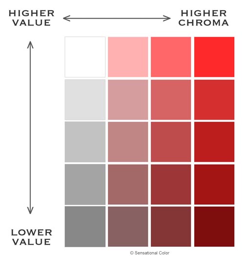
Add black and white to the mix and you produce an even greater variety of colors. Blending black with a pure hue darkens it; conversely adding white lightens it. This changes the amount of light emanating from the color and also changes the color’s value. The Characteristics of Color  - Red Value Diagram  

Value is the attribute that defines the lightness or darkness of a color in terms of how close it is to white or black. The lighter the color, the higher its value. For example, navy blue emits less light and has a lower value than sky blue. It is the change in value that gives you the ability to see objects as three-dimensional. Value also guides your perception of space. There are greater value differences between objects closer to you than those that are at a distance. As objects get further away they also appear to have lower chroma.

The Characteristics of Color  - Perception Sphere

Chroma is the attribute that expresses the brightness or purity of a color. You may not be familiar with the word chroma, because it is often expressed as intensity or saturation. However, intensity and saturation are not exactly the same. Saturation measures the purity of a color in relation to grey. Intensity defines the brightness or dullness of a color. The human eye does not easily perceive the differences between intensity and saturation, thus the terms are often used interchangeably. The Characteristics of Color  - Chroma Charts In its purest form a hue is at maximum chroma. The closer colors are to their pure hue the higher their chroma. High chroma colors are described as clear, pure, brilliant, bright, rich, bold, or vivid. Colors that are less intense or saturated are described as toned-down, soft, muted, subtle, misty, dull, drab or dusty.

The Characteristics of Color  - Value Chroma Chart

Frequently we use color names as shorthand for describing the hue, value and chroma. For example cherry, tomato, raspberry, garnet, and ruby describe a variety of reds. Using color names can communicate the attributes of color in a general way, but are not precise because they can mean different things to different people. When color must be communicated accurately, as is the case in manufacturing or printing, a system of specifications and notations is needed. Munsell created color standards based on visually uniform steps of hue, value and chroma. The ideas behind his simple and logical system may be even more important today than when he created it; as color use and choices expand, so does the need to precisely communicate the attributes of color.

The post The Characteristics of Color appeared first on Sensational Color.

Josef Albers’s ‘Interaction of Color’ Goes Interactive

$
0
0

Interactions of Color App

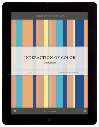
Interaction of Color App for the iPad

As a long time fan of Josef Albers I am thrilled that to mark the 50th anniversary of Josef Albers’s book Interaction of Color, Yale University Press, the publisher of the original edition, are offering a new way to engage with Albers’s lessons by releasing the “Interaction of Color” App for the iPad. This is an awesome app and a "must have" for anyone interested in fully understanding color.Interactions of Color App For just $9.99 the app bundles the book’s full text and more than 125 of its original color studies with 60+ new interactive plates that allow users to perform their own experiments with color. You can see how this works in the video below. Along with the color palette tool there is video commentary that explains Albers’s principles. Another nice feature is that there are interviews with the graphic designer Peter Mendelsund; the artists Brice Marden and Anoka Faruquee; the architect Annabelle Selldorf; the textile designers Denyse Schmidt and Christopher Farr; and the director of sourcing and product development of Fab.com, Brian Mullan, all of whom talk about the use of color in their professional practices; as well as Nicholas Fox Weber, the director of the Albers Foundation.

Video: Interaction of Color App Demo

Video: The designers involved in the project talk about the importance of color and the influence of Albers.

Audio: Design Matters -- Interaction of Color

On this episode of Design Matters, Debbie Millman talks to Brenda Danilowitz, Chief Curator at the Josef and Anni Albers Foundation, and Philip Tiongson, a principal at Potion, a design and technology firm specializing in interactive experiences, about Josef Alber's book Interaction of Color. To mark the 50th anniversary of this groundbreaking book, Yale University is releasing an iPad app of the book. The Interaction of Color mobile app for iPad helps the user understand the book’s ideas, view the plates, experiment, and create and share designs. This interactive edition of one of the most influential books on color ever written offers users an entirely new way to experience Josef Albers’s original masterwork. The free download allows you to view Chapter X, including text, commentary, and two interactive plates, and to experiment with all the features, including the color palette tool. The full version of the app includes the complete text, over 125 color plates, over 60 interactive studies, and a wide range of video commentaries, interviews, and additional features. The full version is available as an in-app purchase for $9.99.

50th Anniversary Edition of the Book: Interaction of Color

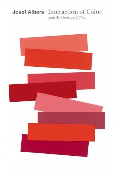
Interaction of Color by Josef Albers

 There is also a new edition of the book so if you want a print copy as well as the app you can buy a copy of Interaction of Color 50th Anniversary Edition.

The post Josef Albers’s ‘Interaction of Color’ Goes Interactive appeared first on Sensational Color.

What Color is Your Night Light? It May Affect Your Mood

$
0
0

Red light at night is best study says

Study Finds That Your Night Light Can Change Your Mood

COLUMBUS, Ohio -- When it comes to some of the health hazards of light at night, a new study suggests that the color of the light can make a big difference. In a study involving hamsters, researchers found that blue light had the worst effects on mood-related measures, followed closely by white light. But hamsters exposed to red light at night had significantly less evidence of depressive-like symptoms and changes in the brain linked to depression, compared to those that experienced blue or white light. The only hamsters that fared better than those exposed to red light were those that had total darkness at night. The findings may have important implications for humans, particularly those whose work on night shifts makes them susceptible to mood disorders, said Randy Nelson, co-author of the study and professor of neuroscience and psychology at The Ohio State University. "Our findings suggest that if we could use red light when appropriate for night-shift workers, it may not have some of the negative effects on their health that white light does," Nelson said.

Red light at night is best study says

The study appears in the Aug. 7, 2013, issue of The Journal of Neuroscience. The research examined the role of specialized photosensitive cells in the retina -- called ipRGCs -- that don't have a major role in vision, but detect light and send messages to a part of the brain that helps regulate the body's circadian clock. This is the body's master clock that helps determine when people feel sleepy and awake. Other research suggests these light-sensitive cells also send messages to parts of the brain that play a role in mood and emotion. "Light at night may result in parts of the brain regulating mood receiving signals during times of the day when they shouldn't," said co-author Tracy Bedrosian, a former graduate student at Ohio State who is now a postdoctoral researcher at the Salk Institute. "This may be why light at night seems to be linked to depression in some people." What people experience as different colors of light are actually lights of different wavelengths. The ipRGCs don't appear to react to light of different wavelengths in the same way. "These cells are most sensitive to blue wavelengths and least sensitive to red wavelengths," Nelson said. "We wanted to see how exposure to these different color wavelengths affected the hamsters." In one experiment, the researchers exposed adult female Siberian hamsters to four weeks each of nighttime conditions with no light, dim red light, dim white light (similar to that found in normal light bulbs) or dim blue light. They then did several tests with the hamsters that are used to check for depressive-like symptoms. For example, if the hamsters drink less-than-normal amounts of sugar water -- a treat they normally enjoy -- that is seen as evidence of a mood problem. Results showed that hamsters that were kept in the dark at night drank the most sugar water, followed closely by those exposed to red light. Those that lived with dim white or blue light at night drank significantly less of the sugar water than the others. After the testing, the researchers then examined the hippocampus regions of the brains of the hamsters. Hamsters that spent the night in dim blue or white light had a significantly reduced density of dendritic spines compared to those that lived in total darkness or that were exposed to only red light. Dendritic spines are hairlike growths on brain cells that are used to send chemical messages from one cell to another. A lowered density of these dendritic spines has been linked to depression, Nelson said. "The behavior tests and changes in brain structure in hamsters both suggest that the color of lights may play a key role in mood," he said. "In nearly every measure we had, hamsters exposed to blue light were the worst off, followed by those exposed to white light," he said. "While total darkness was best, red light was not nearly as bad as the other wavelengths we studied." Nelson and Bedrosian said they believe these results may be applicable to humans. In addition to shift workers, others may benefit from limiting their light at night from computers, televisions and other electronic devices, they said. And, if light is needed, the color may matter. "If you need a night light in the bathroom or bedroom, it may be better to have one that gives off red light rather than white light," Bedrosian said.

The post What Color is Your Night Light? It May Affect Your Mood appeared first on Sensational Color.

Waking Up Well-Rested May Depend On The Color Of Your Bedroom Walls

$
0
0

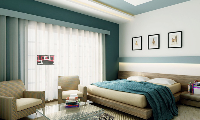
Best colors for a bedroom

Wish you felt more awake during the daytime?

Well, the difference between waking up exhausted versus well-rested may actually depend on the color of your bedroom walls, says a new study by Travelodge UK.

Best bedroom colors

Looking for new color options for their hotel chain, Travelodge UK discovered that the best quality sleep can be induced using soothing, calming color choices with blue being at the top of the sleep color chain.

Yellow and green also received high marks for creating a restful environment. The warm, life-giving quality of yellow is one of the things that make it a very healing hue. Green is a balance of both ends of the color spectrum. It evokes both warmth and coolness. A color ever-present in nature, it nurtures both body and soul.

Large doses of reds or purples would not be useful when trying to design respites for the end of your day. These colors are far too stimulating. Thinking warm browns in your sleeping space? Think about adding tan, aqua or another inviting color. Too much brown can create sad, depressed feelings according the study– the antithesis of the mood you are trying to achieve.

Ellen Kennon, creator of Full Spectrum Paints agrees, “ Nature-based colors are the most restful”. Her paints are "blended from the 7 colors of natural sunlight and closely mimic nature's elements such as sky, water and stone, with infinite color and variation." Here are a few full spectrum bedroom-perfect blues and greens.

Ellen Kennon Full Spectrum Paints  Bedroom Colors

Mary Lawlor of Kelly-Moore Paint added, "Soothing greys that mimic moonlight are said to cue the brain to know that it’s nighttime, and time for sleep have been found to promote good sleep and motivate exercise too." She recommends these five sleep-inducing colors from their The ColorStudio Collection.

Kelly-Moore Bedroom Colors

Wondering why color would have an affect on you even when your eyes are closed?

Human-based researcher, Deborah Burnett, a member of the American Academy of Sleep Medicine wondered the very same thing. She has been studying cases to identify why color and light have such a strong effect on both our quality and quantity of sleep. She suggests that there is a process of getting to that deep restful zone - the time the body preps itself for sleep. During this ‘prep stage’ our body uses its “external or environmental cues including color and light, to synchronize, our biological rhythms to the earth's 24-hour light/dark cycle”. Best bedroom colors Research also shows that our bodies respond differently to light, and thus color at different times of day. When we are in sync with the rhythms of the earth, known as circadian rhythms, our body is energized by the bright white of early daylight. We then respond with relaxation to the dim evening lights. By the time we are ready to lay our head on a pillow, our body is already craving darkness.

How do you create an environment that supports the darkness your body desires and helps you to begin your day with a bright, energetic start?

Burnett thinks green is a ideal choice in the bedroom. She suggests deep Sage. Mid-tone neutrals are good color options for your sleeping space, as well.  She suggests avoiding high contrast colors in your space. Paint ceilings a shade lighter than walls, rather than stark white. These same rules apply for trim on walls and windows.

Whatever color you choose for tranquility in your bedroom, keep the design quiet, calm and soothing. Pay close attention to your body’s natural reactions to color and light then follow its lead.

You might also like:  Infographic: Missing Out On Sleep? Your Bedroom Wall Colors Could Be To Blame

The post Waking Up Well-Rested May Depend On The Color Of Your Bedroom Walls appeared first on Sensational Color.

Alan Alda Asks: What Is Color?

$
0
0

The "What is color" Challenge by Alan Alda

Alan Alda asked scientist to answer the question, "What is color?"

The "What is color" Challenge by Alan AldaFor his 2014 international science contest The Flame Challenge, Alan Alda asks scientists to communicate the answer to the complex question, "What is color?"  in a way that would engage and educate an 11-year-old. What is Color? It’s a fundamental question that spans the sciences. It can be answered from the perspective of physics, chemistry, psychology, even from a geological or oceanographic perspective. To choose this year’s challenge, The Alda Center collected more than 800 questions from children from all over the world. Many different questions were asked about color, including “Is my blue their blue?” “Does everyone see color the same?” and, even one of the most classic childhood questions, “Why is the sky blue?” Do you have a great way to answer that question? You have until March 1, 2014 to submit your answer in writing, video or graphics. For rules and other information visit The Center for Communicating Science. The "What is color" Challenge by Alan Alda

Here is how it works

The entries are screened for scientific accuracy, then  judged by thousands of 11-year-olds in schools around the world. In 2013, there were nearly 20,000 students judges! Two winners will be selected – one Written and one Visual (video or graphic entry). The winners will be brought to New York to be honored in June 2014 at the World Science Festival.

Interested in participating?

I'm thinking of getting a group together to collaborate on a great answer to that question. If you want to help come up with the answer or be willing to critique our submission please leave me a note in the comments below.  

The post Alan Alda Asks: What Is Color? appeared first on Sensational Color.

Why Are Flamingos Pink?

$
0
0

Flamingos pink is well known but it is not the color these birds are born with. They begin life with light gray feather and the coral pink is something they acquire later, but why? Gaining Their Iconic Color: Flamingos Pink These long-legged birds live in wetland areas and consume two things that produce the pigment that changesContinue Reading

The post Why Are Flamingos Pink? appeared first on Sensational Color.

Don’t Be In The Dark About How Light Affects Color

$
0
0

Don’t Be In The Dark About How Light Affects Color

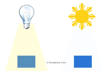
To understand how different types of light affect color you have to know a little about what light is, how it “works”, and its relationship to color.

Light is one of the many waves found on the electromagnetic spectrum. Other waves on the spectrum include ultra violet, radio, microwaves and x-rays. What differentiates light from the others is that it is the only one that can be detected by the human eye.

All of the colors we see are a byproduct of spectrum light, as it is reflected off or absorbed into an object. An object that reflects back all of the rays of light will appear white; an object that absorbs all of the rays, black.

Don’t Be In The Dark About How Light Affects Color

All of the millions of other colors are produced by a combination of light rays being absorbed and reflected. Grass, for example, absorbs all colors except the ones that make up its color of green.

Don’t Be In The Dark About How Light Affects Color

The Effects of Natural Light

Natural light can vary greatly depending on the weather, the season, the time of day, the position of the sun in the sky, the location of the building and where the space is located within the building. Understanding these factors can help you to anticipate how natural light will affect a color.

Light that enters a room from the north casts a cool, bluish tint on the objects is washes over. Using clear hues rather than ones that are muted or greyed. Northern light is indirect and can make colors appear darker and less saturated so you may want to compensate by considering a paint color that is a bit lighter or slightly more intense. (Illustrations: I would show three sets of AP swatches in popular colors. Colors that work best with northern light are light value, bright and clean. Colors best for rooms with southern exposure are medium value, toned, muted or greyed colors. Colors for rooms with either eastern or western exposures are warmer and less muted than those for southern exposure. If you want me to confirm the colors you select just let me know the color # and I will look at my AP fan guide.)

The color of northern light is the most diffused light and remains quite consistent throughout the day. This is why the colors of your paint and fabrics in a room with a northern exposure will remain the same color throughout the day than the same paint and fabrics used in a room with an east, west or southern exposure.

Rooms with southern exposure benefit from beautiful warm light but at time it can be too much light that is too intense or glaring. To solve this problem use colors that are muted with a bit of grey to absorb a bit of the light so the room feels more comfortable.

Light that comes from an eastern or western exposure is also warm. It cast a yellow to orange-yellow or red-orange tint that will change throughout the day as the sun moves across the sky. Light is softer and yellowish in the morning moving to intense and orange or reddish in late afternoon. Using colors that are warmer and less muted will help the color to work even when the sun is not streaming in.

The Effects of Artificial Light

Artificial light supplements natural light so it is important for you to know how a space will be lit when selecting colors. The type of artificial lighting in a space influences how a color looks. Some of the most common sources are fluorescent and incandescent light bulbs, halogen bulbs, and LED lighting.

Halogen lighting is nearly white and the closest to natural light on a clear day around noon. Fluorescent lighting is more bluish although now some fluorescent bulbs produce light band that is close to daylight. Incandescent lighting produces a yellowish light.

When thinking about how your lightening and colors will work together, consider that warm, yellowish light can intensify warm colors and mute cooler hues, while cool bluish light does the opposite. For example, incandescent lighting cast warm light that can enhance reds, oranges and yellows; Cool fluorescent light works best with blues, violets and greens.

Don’t Be In The Dark About How Light Affects Color

The value and intensity of a color are affected by the amount of light, too. In lower light, colors appear darker and less intense. As you increase the amount of light, the value lightens and the intensity increases until you reach its true color. Just keep in mind that too much light can make a color appear less saturated or washed out.

While you can understand how light affects color, choosing colors that will work in a particular lighting situation is still not an exact science. The best way to find the right color is to view a sample of the actual color and material that is at least a 12” x 12” in the space where you plan to use it and look at it in the actual lighting conditions of the space during different times of the day. Always look at the sample in the same plane it will be applied. For example, view wall paint vertically not flat on the floor or table; view rug or carpeting color flat on the floor. By doing this you can see how the color is affected by the light and make the perfect color choice.

The post Don’t Be In The Dark About How Light Affects Color appeared first on Sensational Color.


Fun Color Theory T-Shirt

$
0
0

Color Theory Fun - Purple Is The New Red And Blue

This fun color theory t-shirt design is available on Threadless. It has blue ink printed on a red t-shirt, visually making the letters appear purple.

Fun Color Theory - Purple Is The New Red And Blue

The designer’s tongue-in-cheek saying cleverly plays on a phrase -- (fill in the blank) is the new black -- that is overused by the media when talking about color.

If only mixing blue and red did always produce purple. Anyone that has mixed colors – whether with paint or dye or clay – knows that what when you mix two colors, the result may not always be what you expect. But that’s a post for another day.

The post Fun Color Theory T-Shirt appeared first on Sensational Color.

High Key Low Key Color

$
0
0

High Key Low Key Color Palettes

Every design project is a balancing act. Designers must manage an array of elements – composition, color, lighting, function, shape, and texture – in order to create a cohesive, compelling space. Whether you’re tackling a small scale room remodel or you’re designing an eye-catching poster, one of the biggest challenges both professional and amateur designers face is pulling all the elements together in a way that feels complete and creates an appropriate atmosphere.

Color is frequently a hard-to-manage element, as its very nature resists accurate description, and its perception varies from person to person. Understanding a little color theory can help designers make the transition from adequate to outstanding, and mastering the use of high key and low key color is one of the best ways to get started. Gray Scale High Key Low Key

A low key scheme contains a range of dark value colors; high key contains a range of light value colors.

High key color describes the set of colors that range from mid-tone hues to white, while low key color spans the range from mid-tone to black. In general, the high key range provides upbeat options, while low key colors provide more dramatic tones. The role these colors play in a project is a major factor in the mood or atmosphere that’s created because color elicits emotion – helps to play up the feeling that a designer wants to evoke.

Although color is only one of the design elements used to create feeling in a design, it’s one that can create the framework around which other elements can be employed. Establishing the mood or tone of a space should be one of the very first steps in the design process, as it’s related to function and guides many of the decisions that have to be made, beginning with the color palette. Color precision is frequently the single element that is at fault in designs whose moods are just slightly off – designs that almost work, but don’t quite. Discussions with clients about mood and high key or low key color should often happen early in the design process, as they’re fundamental to getting a project right, right from the start.

So how does a discussion about high key or low key color work? Let’s play with some examples.

High Key Low Key Color Palettes

We’ll start with some color theory everyone understands – we think of blue and other cool colors as calming. We tend to associate cool colors with tranquility and peace, so designers frequently use blues and greens when they’re creating a calm space. Seaglass tones – softened, worn green and lavender, along with greyed, low chroma blues are the classic palette used to evoke serenity.

Like all colors, though, blue isn’t a single shade. Possibilities are endless – from high key, pale blues all the way along the continuum to deep, low key shades. High key turquoise can create a cheerful, bright space, while deep, saturated navy blue can evoke a dramatic atmosphere, particularly when it’s paired with other deep tone, low key colors or contrasted with neutral colors.

Conversely, we think of warm colors – reds, yellow, and oranges – as sunny, dramatic shades. Using low key, deep gold and crimson can be dramatic, but a designer can create less stimulating spaces with higher toned, paler versions of warm colors. Particularly by using tones with little contrast, along with neutral shades, the impact and emotion of a warmer palette can be toned down.

High Key Low Key Interiors

High key low key color schemes used in interior design

For example color consultants and interior designers don’t always have the luxury of working in ideal spaces. We frequently have to manage limitations like an abundance or shortage of natural light. We might be faced with quirky room sizes or shapes. We may have to create a cohesive mood in a space that’s used for multiple purposes. The deliberate use of high and low key color can be the key to making a difficult project work.

A room that typically bakes in the summer sun is the perfect spot to use a high key cool palette to mitigate the warm atmosphere. A kitchen that doubles as an office could be overwhelmed by desk clutter and cooking paraphernalia, but an accent wall in a deep, low key color can draw the eye away from the less appealing elements in a space. Dark spaces – particularly ones with low ceilings – benefit from bright, high key shades that create the illusion of space and light.

Whether you’re looking to create a particular mood, tie together multiple spaces with a cohesive palette, or solve a sticky graphic design problem, playing with high key and low key colors can help you bring balance to your design project. You may opt to flout the rules, using colors in an unexpected way for an edgy, unique atmosphere, or you may opt for a more traditional, classic approach, but understanding how high key and low key colors work lets you make your choices skillfully.

The post High Key Low Key Color appeared first on Sensational Color.

Bauhaus Color | COLOR THEORY QUICK LESSON

$
0
0

bauhaus color

BAUHAUS COLOR THEORY

We think of color as transcendent – a language of sorts that signifies independent of cultural differences, time period, or aesthetic movement.  Color is a powerful tool that permits designers to influence mood, compose spaces, and even make profound statements.  We accept these truths about color, but we don’t often take the time to examine the roots of these core beliefs – where these ideas came from and how they were promoted.

bauhaus color

If fact, it surprises many designers to discover that part of the foundation of our modern understanding of color and its uses is rooted in a design movement dating back to the early 20th century.  The Bauhaus movement and its institute were born in Germany in 1919.  Though the German school only lasted until 1933, when the Nazi government forced it to close, the Bauhaus not only educated many influential artists in a variety of disciplines, but it also spawned programs in other countries, including the US.

One of the most enduring influences of the Bauhaus, though, is the color theory that was taught under four prominent artists.  The contributions of Johannes Itten, Wassily Kandinsky, Paul Klee, and Josef Albers undergird much of what we currently understand and believe about color, and an examination of the teachings of these four artists helps us understand not only the formation of modern color theory, but indeed how color theory is developed and transmitted.

BAUHAUS COLOR ACCORDING TO ITTEN

Bauhaus Color Johannes Itten

"Farbkreis Itten 1961" by Zeichner: Malte Ahrens - Quelle: selbst erstellt

Johannes Itten taught at the Bauhaus from 1919 until 1922, and he taught one of the fundamental preliminary courses that – among other things – grappled with color theory.  Itten gave us a color sphere comprised of twelve colors (three primary, three secondary, and six tertiary) that shows the relationship among colors, as well as gradations of saturation.  The influence of psychoanalysis is apparent in Itten’s color theory, as he was one of the first to associate different colors with specific emotions and study the impact of color on our moods.  He also studied how individuals perceive color.

Itten taught that there were seven different methods of contrast:  contrast of saturation, of light and dark, of extension, complementary contrast, simultaneous contrast, contrast of hue, and contrast between warm and cool colors.  One of his particularly interesting practices in the classroom was to work students through an examination of color and in particular his theory about contrast by first examining abstract works, reflecting the Bauhaus’ move away from exclusively representational works.  After students studied the abstract pieces, they would move on to look at more realistic works, and finally would apply what they had learned of color theory to their understanding of classical works.

Itten’s most enduring contribution to modern day color theory, though, is his characterization of colors in terms of temperature, and his designations of certain colors as warm and others as cool persists to this day.

BAUHAUS COLOR ACCORDING TO KANDINSKY

Bauhaus Color Wassily KandinskyComposition 6" by Wassily Kandinsky, 1913 - State Hermitage Museum

Wassily Kandinsky, the Russian painter best known for his bold, geometric abstract works, taught at the Bauhaus from 1922 until it closed in 1933.  He considered color to be an utterly transcendent language of sorts, a way to examine the universal aesthetic.  He adopted a synesthetic relationship with color, associating particular colors with both specific geometric shapes and with musical tones and chords. Yellow, for example was best expressed as a triangle and was the color expressed by a middle C played on a brassy trumpet.  Circles were blue, and the color black in musical terms was the color of closure.  The examination of color in terms of the fullness of its expression is certainly one of Kandinsky’s legacies.

BAUHAUS COLOR ACCORDING TO KLEE

Bauhaus Color Paul Klee"Paul Klee Zeichen in Gelb 1937" by Paul Klee

Paul Klee taught at the Bauhaus from 1921 until 1931.  Like Kandinsky, Klee tended to think of color in musical terms, making the connection between harmonious sounds and complementary colors, as well as dissonant sounds and colors that clash.  Klee wanted his students to understand that color wasn’t just a tool for the faithful reproduction of nature.  Color for Klee was a powerful device that enabled a painter to shape, compose, and influence paintings, rooms, and even the people who interact with artwork.  In order to fully understand the power of color, students had to see color as freed from its naturalistic, descriptive role.

BAUHAUS COLOR ACCORDING TO ALBERS

Bauhaus Color Josef Albers"Josef Albers's painting 'Homage to the Square', 1965"

Although the Bauhaus closed in 1933, its legacy was far from finished.  Josef Albers first was a student at the school, studying under Johannes Itten, became a professor in 1925, and emigrated to the US after the Bauhaus’ closure.  He taught at several institutions in the US, most notably Black Mountain College and Yale.  Albers dealt both with the very physical reality of color and of paint, in particular, making detailed notes on the precise materials he used in his work, but he was also intrigued by the more abstract aspect of color theory and concluded that colors were governed by an internal and deceptive logic.

As we see in other color theories, the Bauhaus movement acknowledged the frustrating fact that even though color is fundamental, powerful, and versatile, it is also difficult to discuss.  Much in the way that language itself resists our efforts to understand it, the language of color is similarly resistant.

What the Bauhaus gave us, though, is an understanding of color that pushes us to think beyond the representational.  It forces us to confront the real emotional weight of our color choices, and it urges us to try out our terminology that applies to shape and sound in our understanding of color, giving us alternatives that open our minds to innovative and powerful ways to employ color in our work and lives.

The post Bauhaus Color | COLOR THEORY QUICK LESSON appeared first on Sensational Color.

Color by Numbers: Alfred Hickethier Color Theory

$
0
0

Hickethier Color Theory Book

Color can be subtle. It can be vibrant. It can be puzzling, maddening, and elusive. Color can be polarizing, leading us to proclaim our affection for or dislike of a given hue. But one thing we can all agree on is that color is difficult to talk about. Color resists our attempts to understand, explain, and describe it. In fact, for hundreds of years great thinkers have devised various methods and means of understanding color and the relationships between and among the various hues.

We have a variety of color wheels, each with a subtle difference from all the rest, and we have both additive and subtractive models for obtaining a variety of different colors. The reason it’s so important to have a standard, reproducible means of both describing and creating color is that color can be subjective – or at least the way we interact with color can be. Your idea of a perfect spring green might look more like lime green to me. If we rely simply on words, we’re likely to end up going in circles.

Hickethier Color Theory Book

The book Color Matching and Mixing explains Alfred Hickethier color theory and cube

Alfred Hickethier certainly had an interest in finding a precise way to describe and blend colors. He wanted to make lithography and printing in color more consistent, and he published his color cube – a three-dimensional model comprising 1000 individual colors – in 1952. Though there are more than 1000 possible colors, Hickethier believed that more than 1000 didn’t yield meaningful differences – that the human eye couldn’t really discern more colors than his cube contained.

Hickethier Color Theory - Color Cube

A page from the book Color Matching and Mixing shows the Hickethier color cube

Hickethier Color Cube

After Hickethier published the color cube, he published his color mixing system in 1963, and this system is a stunning translation of color – that slippery, vexing topic – into a crystal clear, remarkably simple numerical system. Here’s how Hickethier did it:

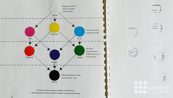
  • There are three primary colors – Cyan, Magenta, and Yellow – along with white and black used to create every one of the 1000 colors on Hickethier’s cube.
  • Hickethier’s system is subtractive, meaning that the addition of pigment absorbs and reduces some wavelengths of light.
  • In the Hickethier Color Theory each color is assigned three-digit numerical values. The five basic color are White (000), Cyan (009), Magenta (090), Yellow (900), and Black (999). Every three-digit number indicates the proportion of Cyan, Magenta, and Yellow pigment used to obtain a given color. The first digit always refers to Yellow, the second digit to Magenta, and the third to Cyan.
  • When you use pure pigment, delivered in measured drops, it’s easy to mix colors consistently. For example, Cyan uses 0 drops of Yellow, 0 drops of Magenta, and nine drops of Cyan. Orange (990) is 9 drops of Yellow, 9 drops of Magenta, and 0 drops of Cyan. Using the numerical formula – and adding black and white for darker and lighter color values – you can create Hickethier’s entire cube of 1000 colors – all with only five pigments.

How Hickethier Color Theory Is Different

So what differentiates the Hickethier color theory model from other competing or complementary models like Albert Munsell’s? Munsell’s model – both at first glance and on a deeper look – is far more complex in terms of its language. We have to understand the particular way in which Munsell used the primary aspects of color – hue, value, and chroma – in order to makes sense of Munsell’s color sphere. Hickethier reduced everything – all 1000 of his colors – to a mere three digits. He adopted a far less subjective language – numbers – to describe color.

By translating color into numbers, Hickethier achieved something perhaps no one else ever has – making color understandable in a completely objective (rather than subjective) way. When you think about the relationship among a set of greens, for example, understanding those relationships in terms of a different number of drops of Cyan and Yellow pigments greatly simplifies what differentiates one color from another by revealing the formula used to create each distinct color.

How Simple Is Hickethier’s Color Mixing System?

So simple a child can do it. It turns out that the most common pure use of Hickethier’s model is found in art classrooms. Using a curriculum developed by art teachers, Rock Paint Distributing, and Triarco Arts and Crafts, students learn to mix pigments, build color wheels, and discuss the subjective aspects of color, all using Hickethier.

While other color theories and systems – like Pantone – have gone beyond the work of Hickethier to regularize color across multiple applications and media – from textiles to computer screens – Hickethier remains relevant for the elegant simplicity of his important color cube and color mixing system.

So much of design involves developing a sensitivity to and a fluency with the language and relationships of color, and Hickethier provides a means of not just labeling color, but actually participating in the making of color. When you blend just the right shade of teal, you begin to hone your sensitivity to the subtleties of colors and their relationships in a way you can’t ever learn from a textbook. A deft touch with color demands a deep, nuanced understanding of how colors interact and play with one another. Blending five pigments to create a kaleidoscope of 1000 colors helps you consciously develop your color awareness and augments your color experience.

Have Fun With Hickethier Color Theory

Hickethier Color Theory Used For Egg Dyeing With Food Coloring

Here is a fast, fun and easy way to put the Hickethier color theory into practice -- dyeing eggs with food coloring. Using just three colors I'll show you how to make 18 different colors that you can arrange into your own egg color wheel.

The post Color by Numbers: Alfred Hickethier Color Theory appeared first on Sensational Color.

Productive Palette: How Color Can Influence Workplace Behavior

$
0
0

productive-palette

You might blame a lack of motivation at work on the previous night’s sleep or the project you’re on or a droning series of meetings. But what about color? The color that surrounds you during your work day plays a bigger part in your productivity than you might imagine. The reason why is that color has a profound effect on the brain, causing it to feel tranquil or depressed, hungry or excited.

For workspaces, that means some colors are better suited to the goal of some spaces than others. For example, blue tends to engender feelings of tranquility and calm, making it a good companion for brainstorming areas. White, on the other hand, obviously offers spaciousness that’s enviable for creativity. How you use color will help determine how well various spots in your office work to their intended goal. Want more advice on color in the workplace? Use this graphic for some ideas.

The post Productive Palette: How Color Can Influence Workplace Behavior appeared first on Sensational Color.

Viewing all 64 articles
Browse latest View live